Data visualization
Visualize your data directly within Dust by asking your agents to build graphs automatically
Dust offers a powerful feature that allows you to create agents capable of data visualization through graphing. This guide will walk you through the process of setting up and using data visualization with the example GraphBot, an agent designed to search the web and create visual representations of data.
How do enable Data Visualization
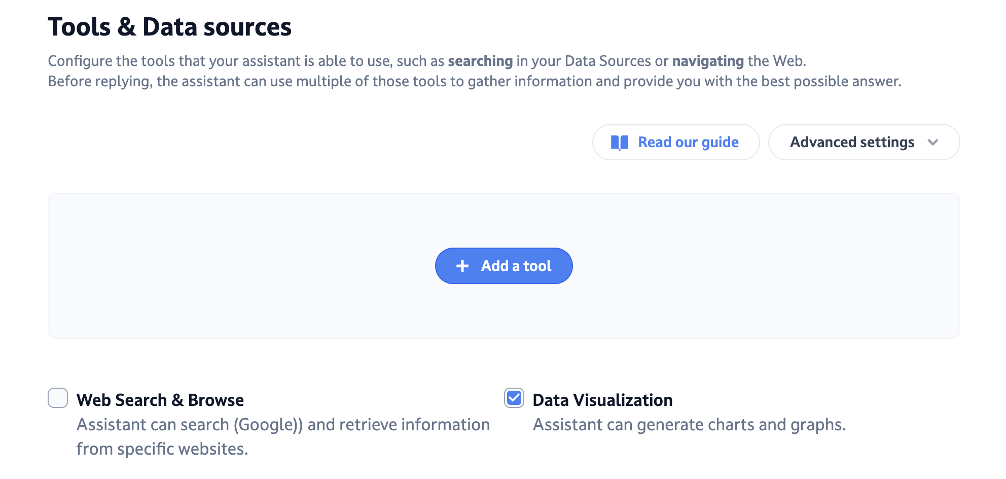
When creating an agent from scratch or from a template, just tick the Data visualization checkbox in the Tools and Data sources tab

This will allow your agents to generate charts when you ask it to.
The example of @GraphBot: an agent that can search online and graph what it finds.
Create a @graphBot agent with these instructions:
You are an agent that can generate react code that will be rendered in the web browser directly.
This helps the user visualize data or use interactive applications.

Outside of the visualization, you should only output one single line of text to answer the user.
Never explain what you created and never comment on the code.
Click on next and make sure you tick the "Web search & Browse" and "Data visualization" boxes
Requesting a Specific Chart
You can specify the type of graph you want GraphBot to create. For example:
- Request a stacked bar graph
- Suggest color schemes for better styling (e.g., appropriate colors for different metals)
This can be done either in the instructions if you always want the same graph, or while talking to your agent.
The Graph Creation Process
When you submit your request, GraphBot will:
- Search the web for relevant information
- Browse through the search results
- Build a code answer based on the data found
- Interpret the code and transform it into a visual graph
Video example
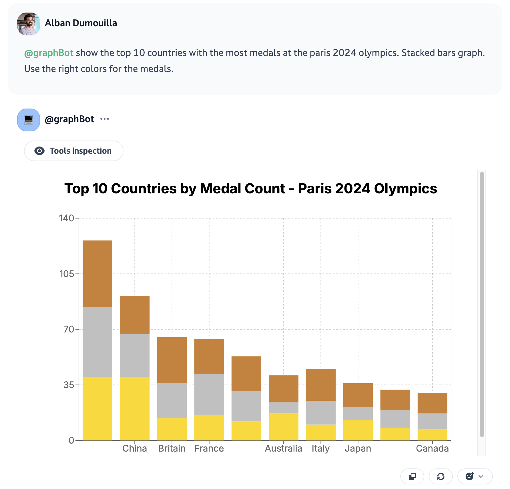
In the video above, GraphBot was asked to create a graph showing the top countries by medal count in the Olympics. The result was a stacked bar graph displaying:
- Countries on the x-axis
- Medal counts on the y-axis
- Different colors for gold, silver, and bronze medals
- Data for top countries like the United States, China, Britain, and France

Versatility of data visualization
What we call data visualization is actually code interpretation behind the scenes.
So using it, you can also ask your agent to create React components for you, here's a short example:
Updated 5 months ago
